The two-thousand-twenty-three vocabulary shift from “luxury” to “quiet luxury” is, in hindsight, one of the more interesting consumer-culture moves of the decade. The Loro Piana baseball cap. The unlabelled Bottega Veneta tote. The Indian wedding guest who now skips the bandhgala embroidered in tinsel and arrives, instead, in undyed silk. The aesthetic shift has been read variously as a reaction against post-pandemic excess, as an Old-Money revival, as a quiet repudiation of logo culture, or as just another phase. All of these readings have something to them.
Inside the home the shift is more interesting because the home, unlike clothing, cannot be changed out at the door. Whatever you build for your living room sits there for years. The “quiet luxury” version of a home is therefore not a passing aesthetic. It is a long-form commitment to a particular set of decisions about how things should look and how much you should own.
This guide is for the Indian reader who has been hearing the phrase and would like a serious working account of it for the home. Where the aesthetic comes from, what its actual rules are, where it lands in an Indian apartment, and the ten foundational pieces that get you most of the way there.
What quiet luxury actually is
The term itself comes from menswear journalism in the early 2020s, but the idea is much older. It describes a form of consumption that signals taste through quality rather than visibility. The fabric is the finest available. The construction is precise. The logo is small, hidden, or absent. The cost is enormous but the casual observer cannot tell. The communication is to a small audience that recognises the codes — and is uninterested in convincing anyone outside that audience.
Applied to the home, quiet luxury has four working principles.
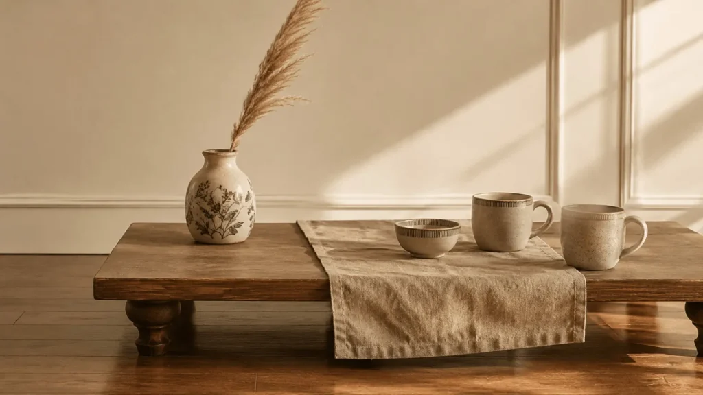
One — restrained palette. The colours of the room are limited to a small group of warm neutrals: champagne, cream, oat, soft clay, deep camel, near-black. No high-saturation colour, no statement walls, no bright trim.
Two — material honesty. Every material is what it appears to be. Linen is linen, not polyester linen-look. Wood is wood, not laminate. Stone is stone, not stone-effect porcelain. Brass is brass, not chromed steel.
Three — proportional sparseness. The room is deliberately under-furnished by Indian middle-class standards. Where convention would put a console table, two lamps, three framed photos, a vase, a candle, and a small statue, quiet luxury puts the console, one lamp, and one vase. The remaining surface is the styling.
Four — invisible quality. The most expensive object in the room is often the least flashy. The hand-thrown ceramic bowl that cost ₹3,000 sits beside the mass-produced books that cost ₹500. The aesthetic is not interested in announcing which is which. Anyone who needs to ask is outside the conversation.
Quiet luxury is consumption that signals taste through quality rather than visibility. The logo is small, hidden, or absent.
The palette in detail
The quiet-luxury palette is narrower than wabi-sabi (which permits more clay tones) and warmer than Japandi (which leans more grey). The dominant colours, in order of frequency:
Champagne. Not yellow. Not gold. A specific warm off-white with a slight golden undertone, often described as “the colour of old book paper” or “the inside of a Loro Piana coat.” Most cream paint colours in the Indian market are too cool — too white, too grey. The right tone leans towards warm, but not towards beige.
Cream. A neutral off-white that holds up against the warmer champagne without clashing. Asian Paints “Tranquil Tan” or “Vintage Hue” are close. The trick is to test the swatch in both morning and afternoon light — many cream paints look correct at noon and turn pinkish at sunset.
Oat and oatmeal. The colour of unbleached cotton, raw linen, untreated jute. The textile colour of the entire aesthetic. Three or four shades of oatmeal in a single room — one in the rug, one in the cushions, one in the throw, one in the curtains — read as a chord, not as a match.
Soft clay and deep camel. The accent colours. A single armchair in deep camel. A leather binding on a book. A clay-coloured throw. These warm browns are what saves the palette from feeling antiseptic.
Burnished gold and aged brass. Metal accents, used sparingly. The hardware on the cabinet. The base of the lamp. A small brass dish on the coffee table. The discipline is: matte or aged, never polished chrome.
Near-black. The anchor colour, used in one or two small pieces per room. A black ceramic vase, a black-framed photograph, a black book spine. The near-black is what gives the eye something to land on against the warm neutrals.
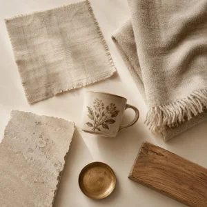
The materials, in priority order
Linen first. Quiet luxury rooms are textile-heavy, and the textile is almost always linen — raw linen, washed linen, sometimes a linen-cotton blend. The discipline is to feel the fabric. Polyester-linen-look is the most aggressive failure mode in the entire aesthetic.
Wool second. A wool throw on the sofa, a wool rug on the floor, a small woollen cushion. The wool brings textural warmth in a way that linen cannot.
Stone third. The kitchen counter, the bathroom surround, the small dish on the entryway console. Marble, granite, Kota stone, terracotta — all in their natural finish, never polished to a mirror.
Ceramic fourth. Hand-thrown or small-batch, in matte or soft-gloss glazes. The ceramic vase collection” >ceramic vase collection and the hand-painted ceramic mugs” >hand-painted mug collection from Mannat Ceramics sit inside this register — small-batch production, hand-applied finishing, restrained painted accents.
Wood fifth. Solid timber, in natural or lightly oiled finishes. Indian timbers (teak, sheesham, mango) work well; avoid heavy varnish or stain.
Brass and copper sixth. As accent metal — small dishes, lamp bases, drawer pulls. Aged or matte, never polished.
What does not belong: glass-and-chrome lamps, glossy ceramics with mirror-smooth glazes, anything labelled “marble-effect,” velvet upholstery (too theatrical), polyester anything, mass-produced framed art, decorative resin objects.
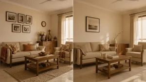
Why quiet luxury works particularly well in Indian apartments
Three structural advantages. First, the default Indian home already contains many of the right materials — solid wood furniture, stone or terracotta floors, cream-painted walls, brass utensils inherited from a grandmother. The work is to identify these and let them lead the room rather than burying them under poor-quality additions.
Second, the aesthetic suits the Indian climate. Indian summer light is harsh; the warm-neutral quiet-luxury palette softens it. Indian winter light is short; the textile-heavy version of the aesthetic compensates for the absence of evening sunlight with layered fabric warmth.
Third, the aesthetic suits Indian apartment scale. Quiet luxury rewards sparseness; the typical 2BHK or 3BHK rewards sparseness; the two preferences are compatible. A loud aesthetic in a 750-square-foot Mumbai apartment crowds the room. A quiet aesthetic in the same apartment makes the room feel larger.
The ten foundational pieces
The full quiet-luxury home contains forty or fifty considered objects. The starting set — the ten pieces that get you sixty percent of the way to the aesthetic — is much smaller. In priority order:
1. A linen sofa cover or three linen cushion covers. The first textile move. Replaces any synthetic upholstery and shifts the entire room temperature.
2. A pair of small ceramic vases. The white textured face vase set” >white textured face vase set at ₹899 covers two surfaces — one in the living room, one in the bedroom — with a single purchase.
3. A taller ceramic vase with an organic stem. The Beige Ceramic Loop Vase with pampas grass” >Beige Ceramic Loop Vase at ₹899 arrives ready-styled.
4. A foundational dinnerware set. The Woodland Floral Terracotta Rim Dinnerware Set” >Woodland Floral Terracotta Rim Dinnerware Set at ₹1,999. The cream base sits in palette; the hand-painted terracotta rim reads as a single accent.
5. Two coordinated hand-painted ceramic mugs. The two morning mugs, the ones you and your partner reach for first. The mug collection” >mug collection offers stoneware white-and-sand options that sit cleanly in palette at ₹399 each.
6. Visible-storage ceramic for the kitchen counter. The hand-painted ceramic canister with wooden lid” >ceramic canister with wooden lid at ₹999 takes one of the plastic-bag-supermarket-purchases out of the visible counter.
7. A small ceramic trinket dish for the entryway. The Cat Heart Trinket Dish” >Cat Heart Trinket Dish at ₹599 holds the keys when you walk in.
8. A wool throw in oatmeal or cream. Across the back of the sofa or folded at the foot of the bed. From a textile store at ₹1,000-2,000.
9. A single piece of aged brass. A small bowl, a candlestick, a vase. A grandmother’s brass diya or a small purchase from a craft store. ₹500-1,500.
10. A linen or cotton runner for the dining table. Sets the tablescape baseline. ₹500-1,500.
The catalogue purchases from our shop come to ₹4,895 — under ₹5,000 — and cover the four most-leveraged ceramic moves. The remaining pieces — linen, wool, brass, runner — come from textile and craft sources at another ₹3,000-5,000.
The discipline of buying less
The most important quiet-luxury rule is not what you buy. It is what you do not buy. The aesthetic is, structurally, a discipline against accumulation. The room contains few enough objects that each one earns its presence. This means:
One vase per surface, not two. The matching pair-of-vases-flanking-the-bed is a hotel move. Quiet luxury keeps one vase, somewhere off-centre. The other vase goes to a different room.
One book on the coffee table, not five. Or one stack of two. Not seven hardback volumes arranged to fill space. The empty space is the styling.
One framed photograph per wall, not a gallery. The contemporary “gallery wall” of fifteen small frames is the opposite of the aesthetic. Quiet luxury favours one large piece or one small piece per wall.
Two cushions on the armchair, not five. Two is the right number. One in a primary tone, one in an accent tone. Five turns the chair into a sofa.
Three pieces on the dining sideboard, not nine. Three groupings (Rule 1 of coffee-table styling applies here) with breathing room between them.
The hardest version of the discipline is not the initial purchase. It is the ongoing one: when you see a beautiful object in a market or a store, the default response is to bring it home. Quiet luxury requires a different default — ask whether bringing this object home means another object must leave. If yes, you can buy. If you cannot identify the object that will leave, you do not buy. The room stays at its current load.
Where to spend and where to save
The aesthetic is famously expensive when scaled to mansion proportions and famously achievable at apartment scale. The trick is allocating the budget correctly. A working hierarchy:
Spend on textiles. The single most-leveraged spend in the entire aesthetic. A good linen sofa cover at ₹4,000 transforms a room more than a ₹40,000 piece of furniture in a synthetic upholstery. Spend here first.
Spend on the one statement ceramic. One hand-thrown or small-batch piece in your line of sight — a vase on the dining sideboard, a sculptural bowl on the coffee table — does disproportionate work. Spend ₹3,000-8,000 on this single piece if you can.
Spend on light fixtures. The pendant over the dining table, the lamp on the side table. Cheap chrome lighting is the most aggressive aesthetic failure in a quiet-luxury home. Spend on warm-toned, paper-shade, or matte-brass lighting.
Save on the structural furniture. The sofa frame, the dining table, the wardrobes. If they are already in solid wood and reasonable proportion, leave them alone. The textile and the styling will do the aesthetic lifting; the furniture only needs to be honest.
Save on the small ceramic accents. Where you need ten small pieces (mugs, bowls, dishes) the small-batch Indian options at ₹300-600 each work as well as imported pieces at ten times the price. The hand-painted mug collection” >hand-painted mug collection sits squarely in this band.
Save on the books. Coffee-table books for styling are about the spine, not the contents. The second-hand market for hardback books with good spines is fine.
What people get wrong
Confusing “minimal” with “empty.” Quiet luxury is not minimalism. The room has objects, textile layers, light variation, depth. It just has them in deliberate proportion. A truly empty room reads as a hotel between guests; the aesthetic requires presence, not absence.
Confusing “neutral” with “beige.” The palette is not uniform beige. It is a chord of warm neutrals with deliberate contrast — the near-black accent, the deep camel armchair, the brass detail. A room of nothing but beige reads as flat.
Buying the look from one store. The aesthetic depends on textural variation between objects. Buying ten pieces from the same store, in the same finish, in one online order, produces a uniformly-finished room that reads as a showroom. Mix sources, mix materials, let the room accumulate.
Treating quiet luxury as a status signal. The aesthetic is, in its honest form, the opposite. The Instagram version that turns it into a Loro-Piana-cap-equivalent has misunderstood the philosophy. The right version is private — you build the home for yourself, you do not photograph it for proof, you let the choices age.
The shorter answer
Restraint everywhere. Warm neutrals only. Honest materials in their natural finish. One vase, not two. One book, not five. One framed photo per wall. The empty surface is the styling. The expensive object does not announce itself.
Start with three pieces — the Loop Vase with pampas grass, the Face Vase pair, the trinket dish — for under ₹2,400. They cover the four most-leveraged surfaces in a typical Indian apartment. The room is recognisably in the aesthetic. Build from there, slowly, never buying more than one object per month, never bringing home anything you cannot pair with what you already own.
Quiet luxury, at home, is mostly a discipline of not buying. The objects you keep, you keep for years. That is the entire move.
Browse the home decor collection” >home decor collection for starting pieces, or read our affordable luxury philosophy” >affordable luxury philosophy for the longer brand-side argument.
Back to journal