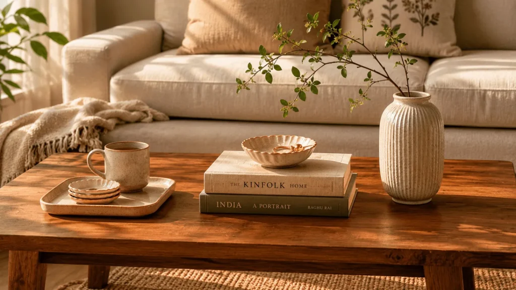
The coffee table is the most-photographed surface in an Indian home and the worst-styled. It carries the remote controls, the empty chai cups, the half-read magazine, the phone charger, and — on its best day — one decorative object that has been sitting in the same position for three years. It is also the surface most directly in the line of sight when guests sit on the sofa. It is, in other words, both the most important styling surface and the least disciplined.
This guide gives you seven working rules and a shape-by-shape application for the five common coffee table types in Indian homes: round, square, rectangular, glass-topped, and marble. The rules are not theoretical. They come from looking at several hundred coffee tables in real apartments, working out what made the good ones good, and reducing it to instructions you can act on without an interior designer.
Rule 1 — Three groupings, not one continuous spread
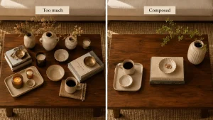
The single biggest mistake in coffee-table styling is treating the table as one long surface to fill. A well-styled coffee table contains three distinct groupings, separated by visible breathing room. Think of the table as having a left third, a centre third, and a right third. Each gets a separate composition. The breathing room between groupings is what makes the styling read as arranged rather than cluttered.
This rule scales by table size. A small round table (under 24 inches) has space for one centre grouping and two flanking minor objects. A large rectangular table (48 inches plus) can carry three full groupings comfortably. The principle holds regardless: separate visual zones, gaps between them.
Rule 2 — Build a height triangle
Inside each grouping (and across the table as a whole) the objects should form a height triangle: one tall element, one medium, one low. A vase with a stem, a stack of books, a small bowl. A tall ceramic candle holder, a folded throw, a single sculptural piece. Without the triangle, the styling reads flat — your eye has nothing vertical to land on and slides off the surface.
The tallest object in the triangle does not need to be at the centre. A common trick is to place the tallest object at the back-right of the grouping, the medium element at the front-centre, and the low object slightly to the front-left. This creates a diagonal that reads as composed rather than blocked.
Rule 3 — Use a tray as the structural anchor
A small tray on the coffee table does three jobs simultaneously. It groups the small objects that would otherwise read as clutter (the small bowl, the trinket dish, the matchbox). It creates a visual frame within the larger surface, making the styling look intentional. And it lets you clear the table for actual use in one motion — pick up the tray, move it to the sideboard, the coffee table is clear.
The right tray for an Indian coffee table is small — six to ten inches across — and made of a material that contrasts with the table beneath. A pale ceramic tray on a dark wood coffee table reads correctly. A wooden tray on a glass-topped table reads correctly. A glass tray on a glass-topped table reads as if you accidentally bought two of the same thing.
We currently carry the Cat Heart Trinket Dish” >Cat Heart Trinket Dish at ₹599 and the Ceramic Star Trinket Tray” >Ceramic Star Trinket Tray at ₹699 as small-format options. For larger formats, acacia wood trays and brass-rimmed serving trays are coming to our catalogue later this year — coming to The Plush Republic later this year. In the interim, almost any plain wooden chopping board cropped to 10 inches works as a styling tray — the kitchen drawer is allowed to supply the styling cupboard.
A small tray on the coffee table does three jobs at once: it groups the clutter, it creates a visual frame, and it lets you clear the table in one motion.
Rule 4 — The book stack is a sculptural object, not a reading pile
Two hardback books, stacked, with a small object placed on top, is the most reliable coffee-table styling unit in the entire vocabulary. The books provide a low rectangular base. The object on top provides the focal point. The two together read as one composed gesture rather than two competing ones.
The discipline is to choose the books carefully. Spines visible: choose books whose spines you can show. Avoid the small floppy paperback (looks like reading material rather than styling). Choose hardback editions, ideally with cloth bindings, ideally in tones that match the rest of the room’s palette. Two books is the right number — three starts to read as a pile, one feels too thin.
The object on top of the books is the chance to introduce a small sculptural element. A small ceramic bowl. A hand-painted dish. A polished stone. A small vase. The object should be smaller in footprint than the top book — it should sit cleanly within the book’s outline.
Rule 5 — One organic element, never more
The coffee table should carry exactly one organic element — fresh flowers, dried branches, a small plant, or a single piece of fruit in a bowl. The organic element brings life to the composition and prevents it from reading as a museum display.
The rule is “one.” The Pinterest version of coffee-table styling often shows three vases of flowers, a houseplant, and a bowl of lemons all on the same surface. This is not styling — it is a botanical garden. One organic element per surface is the discipline.
For Indian homes, the most reliable organic element on a coffee table is dried pampas grass, a single dried branch, or a small bunch of wheat stalks. They survive the months you forget to water plants. Fresh flowers work for special occasions but die within five days. Houseplants do not belong on coffee tables — they belong on the floor or on a window sill where they get light.
The Beige Ceramic Loop Vase set with pampas grass” >Beige Ceramic Loop Vase set with pampas grass at ₹899 arrives ready-styled. You unpack the box, place the vase on the table, and the styling is done. For most Indian coffee tables this single object is enough — combined with one book stack and one tray, it satisfies all five rules above with three purchases.
Rule 6 — Leave 60% of the surface empty
This is the hardest rule for most Indian homes. The instinct is to fill the table with objects to “make it look styled.” The discipline is the opposite — at least 60% of the table surface should be visible. The empty space is what makes the objects read.
The practical test: if you can place a coffee mug on the table without rearranging anything, the table is correctly styled. If you cannot, you have too many objects on it. Remove one and try again.
Rule 7 — Style for the person sitting on the sofa, not for the camera
The coffee table is photographed top-down for Instagram. It is experienced at sofa-height by every actual visitor. The styling that looks best top-down does not always read at sofa-height — top-down hides the height triangle, the camera flattens the verticals, and a low arrangement of all-short objects looks fine in the photo but reads as empty when you are actually sitting in the room.
The discipline is to check the table from sofa-height before you decide it is done. Sit on the sofa. Look at the table. Does the composition have a vertical element you can see? Is there a focal point your eye lands on? If the answer to both is yes, the styling is right for the room. The Instagram photo will follow.
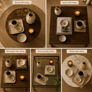
Shape-by-shape application
Round coffee tables (24-36 inch diameter)
Round tables are styled with a single central composition rather than three groupings. The circle resists left-right zoning. Place a low ceramic tray or a stack of two books at the centre. Place a single vase slightly off-centre on the tray. Place a small bowl or dish on the opposite side. The composition reads as a small triangle drifting across the circular plane.
Avoid the temptation to put one object dead-centre. The mathematical centre of a circle is a uncomfortable visual choice — the composition needs to be slightly off the centre line to feel composed.
Square coffee tables (30-42 inch sides)
Square tables work in quadrants. Style two diagonally opposite quadrants and leave the other two empty. The most common configuration: top-left quadrant carries the height (a vase with a branch); bottom-right quadrant carries a small grouping (a book stack with a dish on top); the other two quadrants stay clear.
This rule is what saves square tables from the “everything in the middle” trap. Diagonal placement creates motion across the surface in a way that centered placement does not.
Rectangular coffee tables (36-60 inch length)
Rectangular tables are the easiest to style because they accommodate the three-grouping rule cleanly. Left third: a tray with two or three small objects. Centre third: a book stack with a single ceramic object on top. Right third: a vase with a single organic element. Breathing room between the groupings.
If the table is on the longer end (48 inches plus), each grouping can carry slightly more — three objects in each zone rather than two — and the height triangle can be more pronounced.
Glass-topped coffee tables
Glass tops are the hardest surface to style because they reveal the lower shelf and floor through them. The shelf below — if there is one — needs to be styled as carefully as the surface above. A folded cotton throw, a small basket, a stack of magazines, anything that gives the eye something to land on when it sees through the glass.
On the glass surface itself, prefer slightly heavier objects than you would on a wood table. Lightweight ceramic dishes can look as if they are floating on a glass table; matte-glazed pieces with visible weight read better. The Cat Heart Trinket Dish in white ceramic works particularly well on glass because the matte ceramic contrasts with the reflective surface.
Marble coffee tables
Marble has its own visual texture — the veining of the stone is itself a composition. The styling has to respect this. Fewer objects. Larger objects. Avoid small clutter. A single ceramic vase, one stack of two books, one small dish: that is the entire styling load for a marble table. Anything more competes with the stone for attention.
If the marble is heavily veined (Calacatta, Statuario), keep the objects in a narrow palette of off-white or pale clay. If the marble is plain (white Carrara or solid travertine), you can introduce one darker accent — a black ceramic vase, a brass bowl.
Seasonal refresh: the four-step swap
Once the styling is built, refreshing it every two or three months keeps the room from going stale without requiring a full restyling. The four-step swap:
1. Change the organic element. Swap the pampas grass for a single fresh hydrangea in summer, a bunch of dried wheat in winter, a sprig of eucalyptus in monsoon.
2. Change the textile. A folded throw across one corner of the table. Linen in summer, wool in winter, a cotton dhurrie in monsoon.
3. Rotate one ceramic. Swap one of the three styling objects for something else from your existing inventory. The vase moves to the sideboard; the small ceramic from the sideboard moves to the coffee table.
4. Change the book on top. The bottom book stays; the top book gets swapped to something seasonally relevant. A poetry book in winter, an art monograph in summer, a coffee-table photography book in monsoon.
Total swap time: under ten minutes. Total cost: zero. The room feels new every quarter.
Common mistakes, fully diagnosed
The everything-symmetrical layout. Two identical objects on either side of the table, with a third in the centre. The composition reads as institutional — like a hotel lobby or a doctor’s waiting room. Break the symmetry: move one of the matched objects to a different surface.
The all-low arrangement. Three short objects, no height. The eye slides over the table. Add one vertical — even a tall candlestick or a single tall vase fixes the composition instantly.
The matching-set syndrome. All three styling objects in the same colour and material. Reads flat and over-coordinated. Introduce one tonal contrast — a near-black object among the cream-and-clay set, or a single brass piece among ceramic.
The Pinterest-perfect mistake. Trying to recreate a styled photograph from Pinterest object-for-object, regardless of whether it suits your room. The photo was styled for that specific space and that specific light. The rules above will transfer; the exact object list will not.
The functional-object overload. The coffee table is buried under remote controls, the TV box, two phone chargers, and a stack of bills. No amount of styling will work until these functional objects move off the table. The tray (Rule 3) does some of this work — group the remotes and the chargers onto the tray, the table becomes legible again.
The shorter answer
One vase. One tray. One book stack with a small object on top. Sixty percent of the table empty. Check it from the sofa, not from above. Total cost under ₹2,000 if you buy the vase and the tray; less if you use a book stack you already own.
That is, in compressed form, the entire coffee-table styling system. Read the seven rules again the next time you have ten minutes and the table looks tired. The diagnostic almost always reveals one specific rule that is being broken. Fixing that one thing fixes the table.
Browse the home decor collection” >home decor collection for the vase, the tray, and the small ceramic dishes the system depends on.
Back to journal